Rules for designing the perfect banner
Despite widespread digitalization, despite the practice of banner advertising due to the inability to calculate the effectiveness of such a placement, outdoor advertising or that on the Internet sometimes does not work.
But it only works for 5% of advertisers.
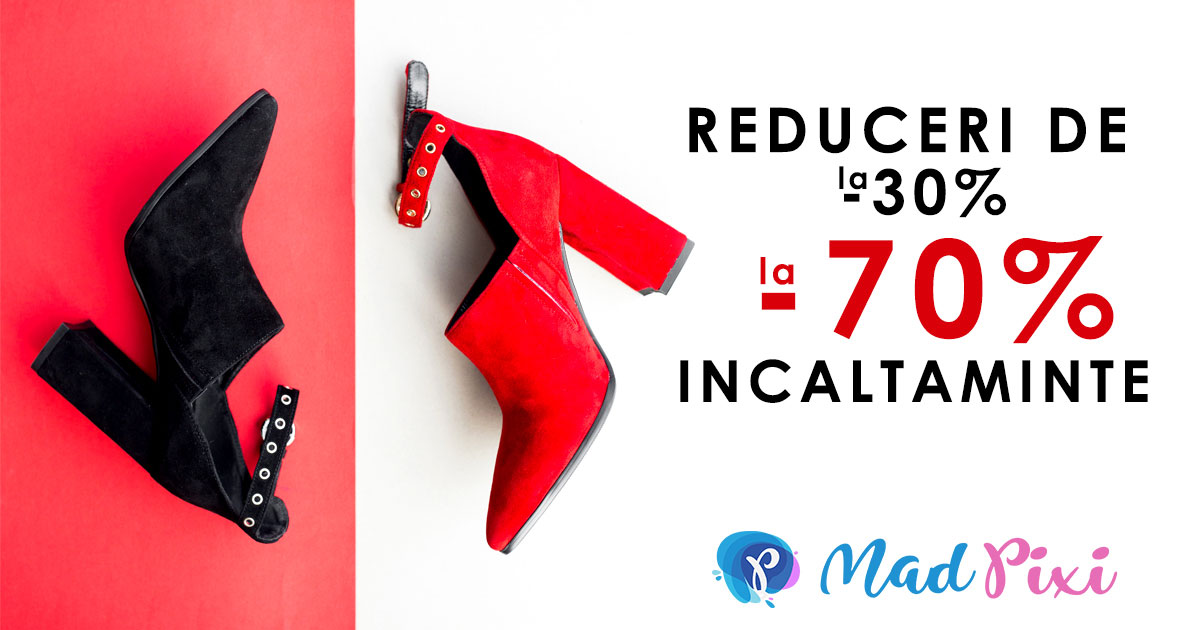
There should be "air" on the banner and the more, the better. And do not think that if the billboard is 18m2, then you can walk there and talk about all your promotions and benefits. The percentage of space occupied by text and graphics must be the same, regardless of the size of the advertising space. In fact, at least 60-70% of the banner should be occupied by an unobtrusive, or better, solid background.
.jpg)
Do not overdo it. You create colossal difficulties for a potential customer: to see your poster in the city, to read, to be interested, to remember, to make a decision. But he didn't need it at all. That's why we always advertise only one offer: the most attractive, the most "delicious". If you think that icons, labels, footnotes, subheadings are a harmless addition that will only decorate the banner, then forget it. This is not true. Feel free to make your banner and to give up everything secondary.
Гласували: 1, рейтинг: 5.0


