Rules for making banners
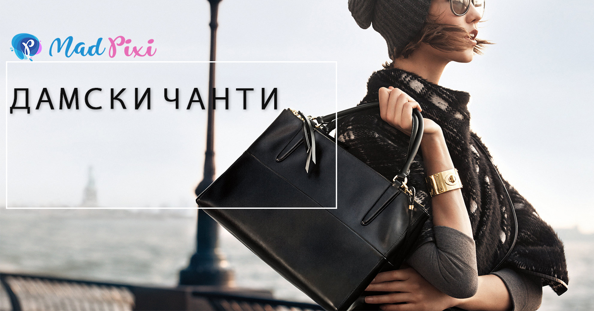
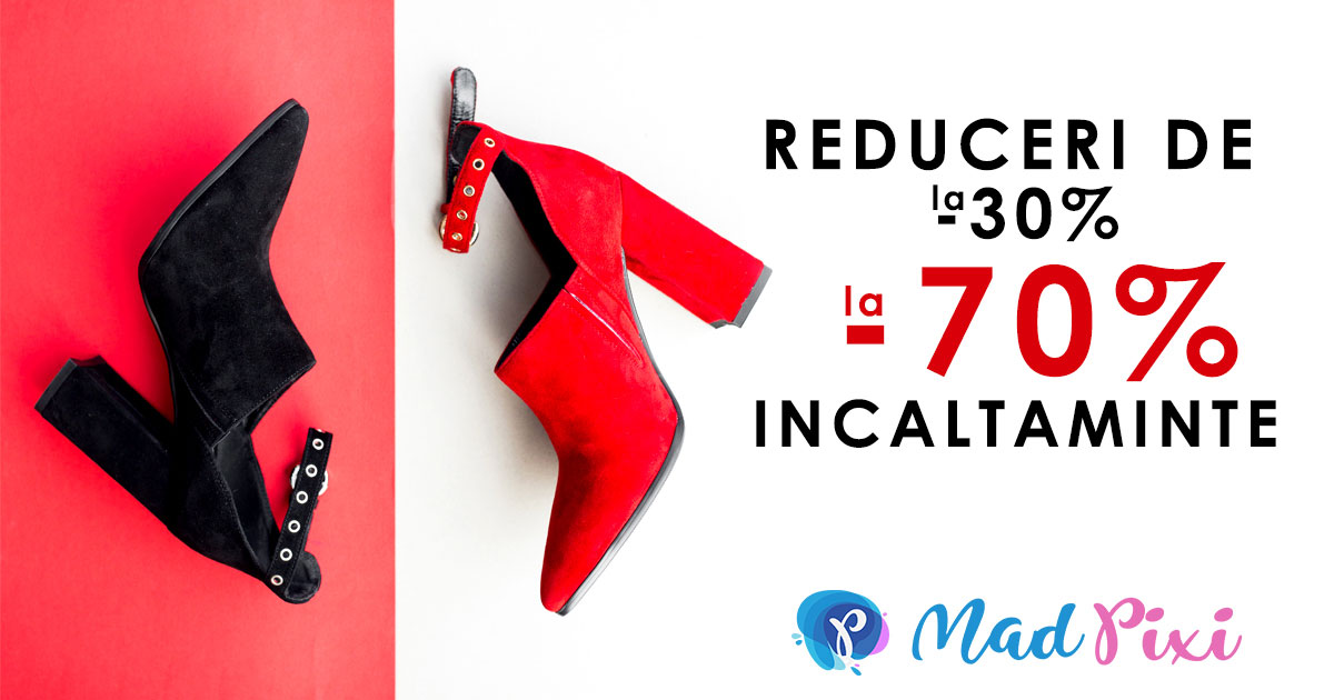
Here we will outline the basic rules for creating banners that we stick to. When we making banners using random photographs (rather than specific ones provided by the customer), we always choose an attractive photo (according to the banner theme) with high resolution and perfect quality. For us, a major role for the banner's vision plays a well-chosen and spectacular picture.
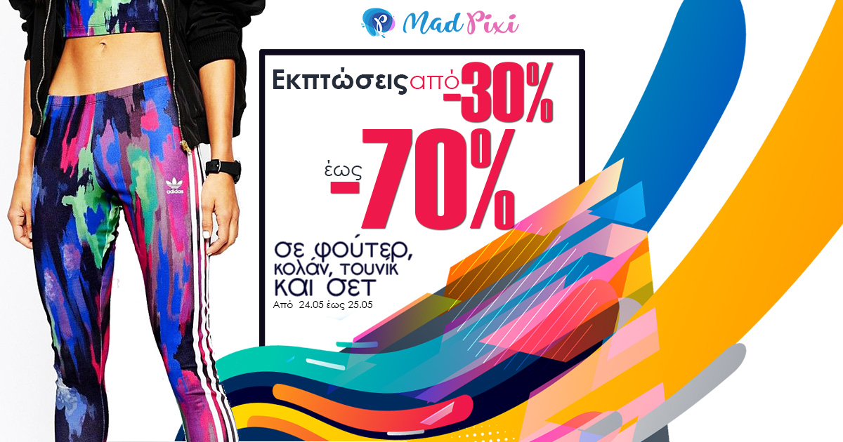
Typically, we strive to have bright shots and good contrast to make the banner stand out.

Another important part of the banner is the well-chosen font. We avoid shadows, contours and borders as they no longer used in modern banner design. In recent years, the font has tended to be "flat," but of course as with every rule exceptions are sometimes allowed.

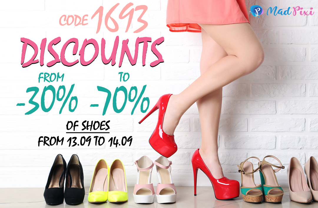
We always try to put the font and logo in the right place and on the appropriate background to make them clearly legible. We use clean and simple effects, our idea is not to divert attention from the product.
We save the finished products with Photoshop setting "Save for web", JPEG - 55% quality, so the banners are always of perfect quality, but they are also lightweight and ready for direct use without the need for additional processing.

You can take a look at our banner portfolio.
Гласували: 2, рейтинг: 5.0
